Exploring Color
The most important element of acrylic painting is understanding color. All colors are created from some combination of the 3 primary colors: Red, Yellow, and, Blue
Secondary colors are created by mixing together equal parts of 2 primary colors.
Secondary colors:
Red + Yellow = Orange
Yellow + Blue = Green
Blue + Red = Violet

COLOR WHEEL
When learning to mix colors while painting, few tools are as important as the color wheel. A color wheel helps by identifying complementary and analogous colors and can aid in deciding how to mix colors together.

Key Terms to remember for acrylic painting
Analogous Colors – these are colors that are adjacent, or next to each other, on the color wheel for effective coloring and shading in art.
Complementary Colors – these are colors that are directly opposed to each other on the color wheel.
When thinking about analogous and complementary colors on the color wheel, it's best to limit yourself to primary and secondary colors while creating art. The primary color is a color used in the mixing of other colors (i.e. red, blue, and yellow), while a secondary color is a result of mixing your primaries (orange, violet, and green).
On the color wheel, orange and yellow are analogous. Orange and blue, on the other hand, are complementary. Mixing analogous colors can lighten or darken a color while maintaining that color's intensity. Adding a complementary color will typically darken or lighten a color while dulling its intensity.
Colors also have warm or cool properties. Warm colors include red, orange and yellow, while blue, violet and green are cool colors. Warm colors are often associated with heat, anger, intensity, and passion. Cool colors typically are associated with cold, sadness, and calm. The same color can also have warm and cool variations, for example, a warm red will lean more toward orange in its intensity, while cool red will have more blue or purple quality.
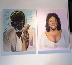
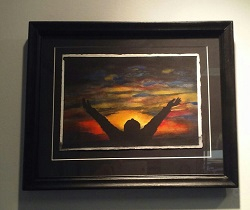
If you would like to learn more about acrylic painting, come in and see us. This is just one of the fine arts classes taught at 9Muses Art Center. Classes are taught by professionally trained staff.